
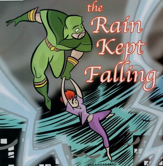
Evolution of the characters....
For Heroes Rebored I really wanted to design the characters before I even approached a artist for illustration. I had some problems in the past with a previous artist who wasn’t happy with me being vague...to be honest I was lazy. This time around I made sure I provided as many details as possible. Sometimes I went overboard in my script.
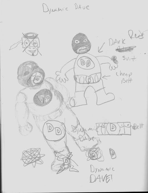
For example this is the illustration I did for Dynamic Dan. The one that looks like a 7 year old's drawing is mine. The other was drawn by Michelle Segui a very dear friend of mine.
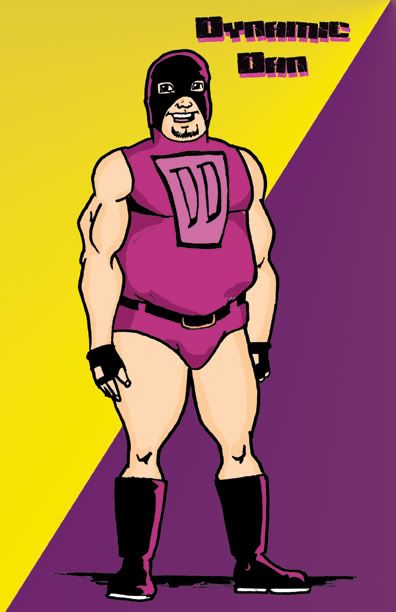
This is what Charlie came back with, He will be wearing pants! I think he took the wrestling look a little too far but I still like the look, especially the colors. We had danced around the issue of colors, I had mentioned purple but Charlie added the gloves.
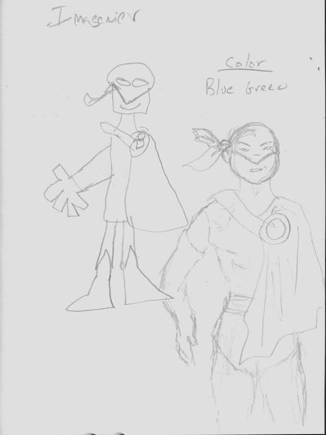
For the Imagineer, since I wanted to be creative but it just wasn't working. I even asked Michelle to help me out. The only concrete idea I had was that the colors were going to be blue and silver.
But then I remembered that Tom (who the character is based on) has already drawn himself as a superhero for a dream sequence. So I took the design and ran with it.
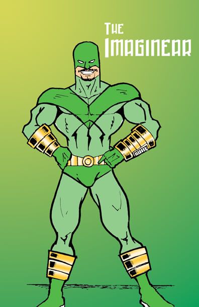
This was the final result, I told Charlie to ad a the cape in the future because I want to have that iconic look. But Charlie added the gold to the costume which really went well with it. Tom liked the result but he said he looks more like Peter North.
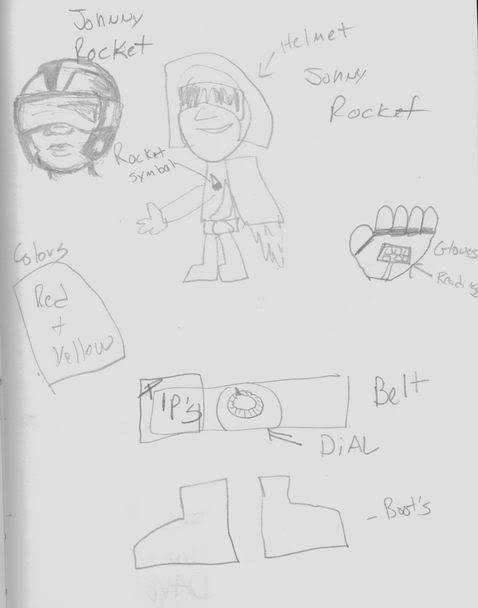 For Johnny Rocket I kept having this picture a specific helmet in my mind, but I couldnt quite get it across. Thankfully Michelle helped me out. But I was very specific with the belt, I really wanted that corny looking timer dial that you see on the old ovens.
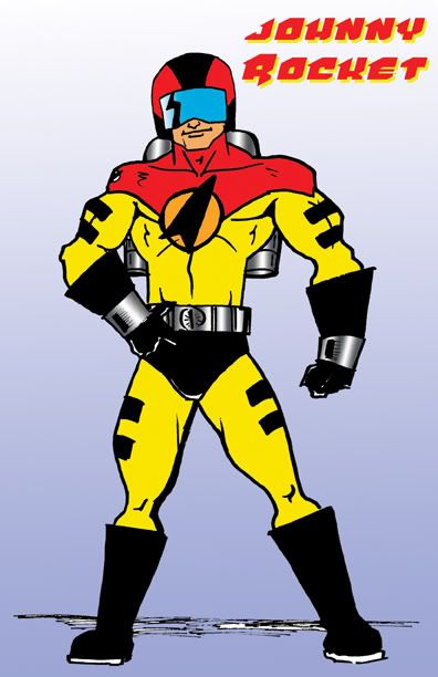
Charlie really improved the chest symbol, it looks so 1950's. He also made the rocket pack more compact.
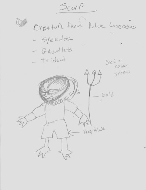
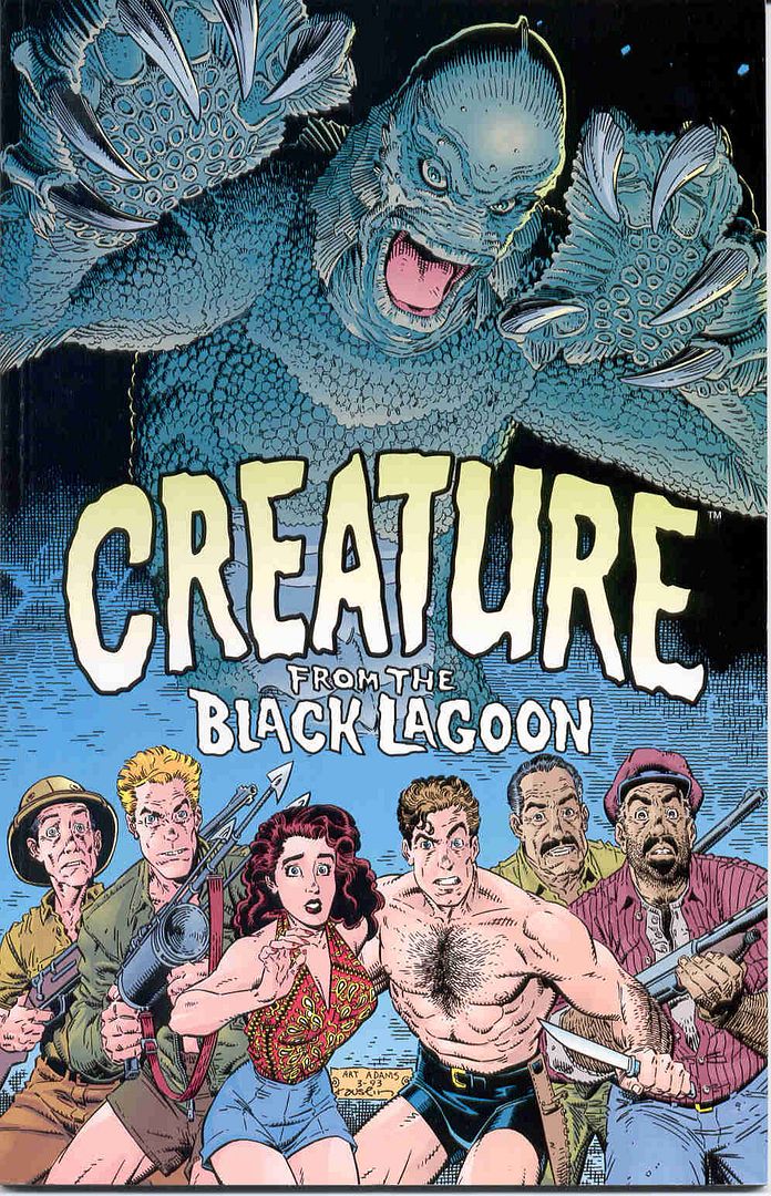
For Scorp it was a blatant rip off of the creature from the black lagoon. I added the Bermuda shorts since Scorp is based on a friend who always wears these corny shirts.
Of course he has to have a trident, come on it's a must!
This is the image that I sent Charlie in order to get my point across, I think its from the guy who drew Danger Girl. Not quite sure...
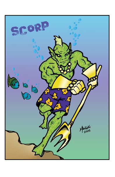
The final result was pretty neat, we will have to loose the gloves though. Charlie and I thought it would be something new, but it just didn't work. I guess it will be just flippers.
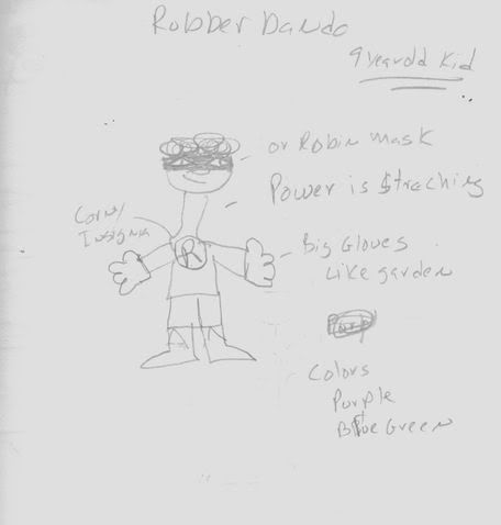
With Rubberbando, I really just wanted the annoying kid character. He is based on Tom's nephew who is probably the biggest Beland fan of all time, for Halloween he stapled photocopies of his work to and old t-shirt, and he said that he was the comic. Yeah I cant even come close to calling myself a fan after that...
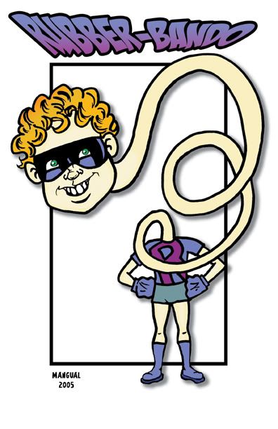
See I know its very to close to what I drew but, Charlie really outdid himself with this one. I love the face, especially the hair. He just made him look like an annoying kid. Perfect!
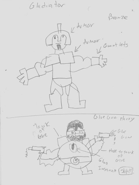
And here are the bad guys! Gladiator was pretty bland. Mostly it was just armor, I mean he’s a gladiator. I didn’t want to do anything different, I wanted to keep him a classic, i miss those old Marvel villains that really looked like their name! I mean Frog Man looks like a frog, and The Human Fly looks like a fucking fly! Its not like now a days where its all abstract or they look nothing like their alias.
For Glue Gun Harry I wanted him to be the most pathetic looking villain of all time. I dont think hes won the prize (Mysterio still holds the tittle) but I think he might at least be rookie of the year.
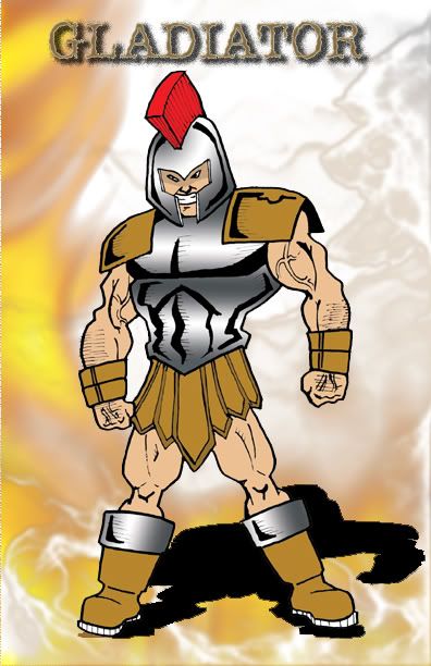 Charlie really wanted the Gladiator to look like a reject from the Rob Liefeld days of Image. He really has a boner for ripping on Liefeld, since for a number of years in Puerto Rico you couldn't throw a rock without hitting a Liefeld fan (this was in the 90's). And any self respecting artist will rag on Liefeld. But Gladiator represents the corny Image comics bad guys with a Marvel twist.
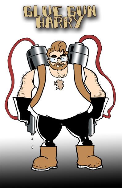 Charlie and I were goofing around for the look of Glue Gun Harry, I was still pretty ticked off at George Lucas for wasting my time and money with the Star Wars prequels so he wound up as Harry. This was my form of revenge.
I liked the chest symbol Charlie came up with, it looks like a stain but it really is his chest symbol...
Well these are the characters that appear in the first issue. As you can see some of the final designs were the same as the beginning and some went a completely different way.
 Comic Makers Feed


2 Comments:
Here's a character!
http://home.cc.umanitoba.ca/~umyanisd
The cover from CREATURE FROM THE BLACK LAGOON was drawn by Arthur Adams.
Post a Comment
<< Home