The Cover....
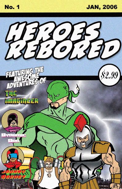
Ah the cover, probably one of the single most frustrating piece of art that you will ever face while making your comic. It has to call out to the casual buyer but also represent the contents of the book. Sure it can be fun but keep in mind that you are selling a product and being a small press publisher you need to stand out against Marvel, DC, and bigger independent publishers.

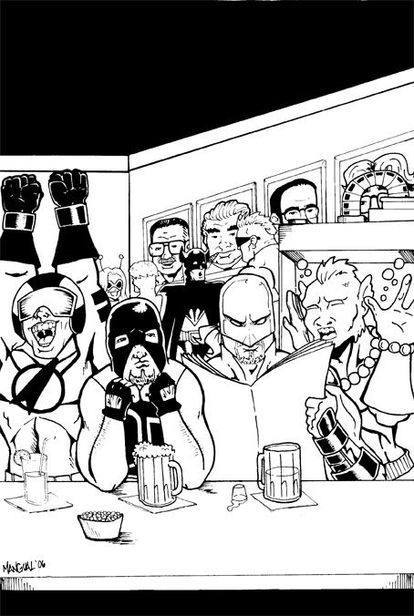
Charlie first sent me this cover he was toying with at home in his spare time. I liked it since it was very retro and reminded me of the old DC Legion of Superheroes Comics. But It gave the impression that the book would be standard superhero action. Which it wont. So we rejected it...

This will probably be the cover we use, Although it will have a couple of changes. For one, Scorps gloves and Johnny's expression. But I really enjoy this cover since it sums up what the comic is about. Not to mention Charlie really captured the atmosphere with his backgrounds (look its Kirby and Lee in a comic again!).


 Comic Makers Feed


4 Comments:
Hey man, nice space!!! The story looks good so far. Do you think it will be ready by May for David's convention?? I'm looking forward to read it.
Well the plan is to have it done by march/april. And if thats the case then i will have it at Davids Con and hopefully in June i will be Mocca
Excellent stuff gentlemen. I am going to bookmark this page and spotlight you guys on my website. It's perfect for our upcoming Comic Book Week.
Wow! Thank you so much Frosty! You like me! You really like me! Yay!
Post a Comment
<< Home